Content Table:
Introduction to React Portals
Benefits of Using React Portals
Syntax in React Portals
Example: Basic Portal Setup
How to Use React Portals: A Step-by-Step Example
Steps to Create a Modal in React
Use Cases of React Portals
Event Bubbling Inside a Portal in React
When Should You Use and Not use React Portals.
As web applications grow more interactive and complex, developers usually face struggle when they try to render some UI components outside the usual hierarchy of their application. Consider modals, dropdowns, tooltips, or pop-ups, they usually must be shown above other content or outside of closely contained parent containers.
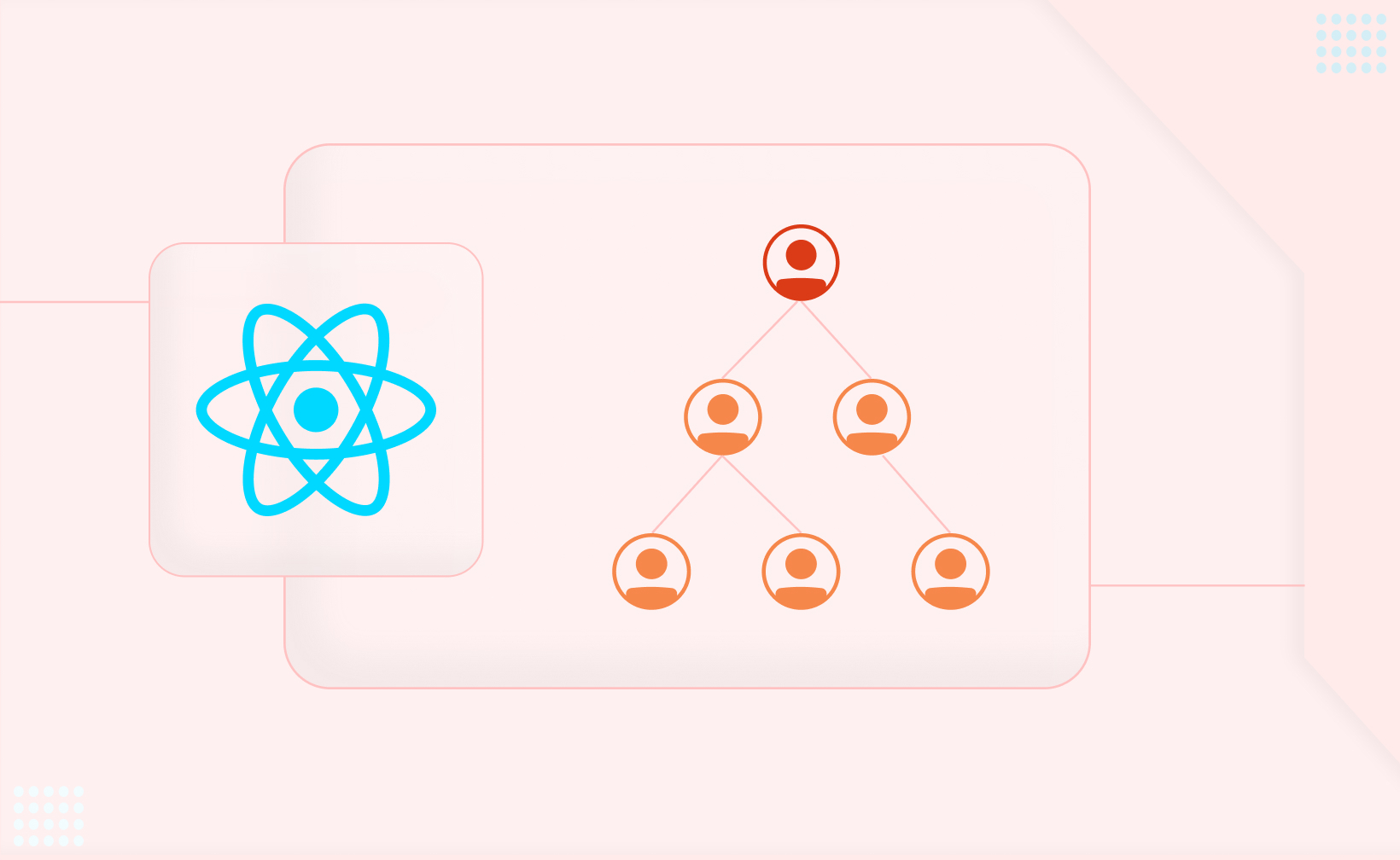
React renders your app inside single react tree with a root DOM element, usually a div with an ID like root. Every component of your entire application, from the main app to the smallest child, lives inside that structure. But what if you need to render something outside this DOM react tree? That’s where React Portals can help you.
React Portals let you render a component into a different part of the react DOM itself, outside the regular parent-child hierarchy of your React app. Despite rendering outside the normal react DOM and flow of react application, the portal element and content remains fully connected to the React component tree, so you can pass props, manage state, and handle events like normal.
React Portals give developers more control over where and how components appear in the DOM. Below are key reasons why they improve both development workflow and user experience.
React Portals allow you to place components in any part of the DOM, not just within their parent element’s structure. This flexibility is especially useful for UI elements like modals, tooltips, or dropdowns that must visually break out of their usual container or layout.
You can keep a component’s logic inside its parent in the React component tree with portals, while displaying its output elsewhere in the DOM. This separation keeps your codebase cleaner, easier to understand, and simpler to maintain as the app grows.
When you render components through portals, you reduce the chance of CSS styles leaking in from parent or sibling elements. This isolation protects your component’s styles, helping them behave predictably and look consistent regardless of where they appear.
Accessible UI elements like modal dialogs or alerts benefit from being placed near the top of the DOM. Portals let you do this, making it easier for screen readers and assistive tools to detect and announce important content. This improves the usability of your app for all users.
Sometimes, you need to combine React components with third-party developer tools or libraries that aren’t built in React. Portals help you render React components exactly where those external tools expect them, without disrupting your app’s structure or flow.
Placing a front portal component outside the regular React component hierarchy, you can update it without triggering re-renders across the whole app. This isolation can lead to better performance, specially in large applications where efficiency matters.
Using this is simple and only requires one key function: the createPortal function lets you render a React component into a DOM node outside of your app’s main root element.
Here’s the basic syntax:
import React from 'react';
import ReactDOM from 'react-dom';

ReactDOM.createPortal(child, container);
child: This is the React element (JSX) you want to render.
container: This is the target DOM node where you want to render the child component — it exists outside your main app’s root div.
Let’s see a example. Say you have a Modal component that you want to render at different location at the end of the document body, not within the current component’s DOM tree.
import React from 'react';
import ReactDOM from 'react-dom';

const Modal = ({ children }) => {
  return ReactDOM.createPortal(
    <div className="modal-overlay">
      {children}
    </div>,
    document.getElementById('modal-root') // Target DOM node
  );
};

export default Modal;
In this case, modal-root is a div you’ve added manually in your HTML file:
<!-- index.html -->
<body>
  <div id="root"></div>
  <div id="modal-root"></div> <!-- Portal Target -->
</body>
This setup allows the modal to render outside the main component unmount React app’s DOM hierarchy, and behave like any other React component in react application in terms of state, props, and lifecycle.
React Portals allow you to render components outside of the normal DOM hierarchy of your React app while keeping them fully connected to the component logic. This is incredibly useful for elements like modals, tooltips, dropdowns, and popups that need to break out of parent containers visually or structurally.
Let’s build a simple modal to see how React Portals work in action.
React doesn't recommends using Create React App, so we’ll use Vite, which is a faster and more modern alternative to scaffold the react application for our project.
Run the following command in your terminal:
npm create vite@latestFollow the prompts:
Enter your project name.
Choose React as your framework.
Select JavaScript as your language, and consider this step-by-step guide to converting HTML to JSX for better understanding and improved coding efficiency.
Then, install dependencies and start the development server:
cd your-project-name
npm install
npm run dev
Note: If you're using Create React App, you can continue with it. Portals work the same way in any React setup.
In the App.jsx file, we’ll render a button that triggers a modal when clicked. We’ll control the modal’s visibility using the useState hook.
import React, { useState } from 'react';
import Modal from './Modal';
import './App.css';

export default function App() {
  const [isModalOpen, setModalOpen] = useState(false);

  return (
    <div>
      <button onClick={() => setModalOpen(true)}>Open Modal</button>
      <Modal isOpen={isModalOpen} onClose={() => setModalOpen(false)} />
    </div>
  );
}
Clicking the button sets isModalOpen to true, and appear the model.
The Modal component gets two props
isOpen: controls whether the modal is visible.
onClose: closes the modal by updating the state.
Next, let’s create a Modal.jsx file where we’ll use createPortal to render the modal content outside the main part of the DOM and node and tree.
import React from 'react';
import { createPortal } from 'react-dom';
import './Modal.css';

export default function Modal({ isOpen, onClose }) {
  if (!isOpen) return null;

  return createPortal(
    <div className="modal-overlay">
      <div className="modal-container">
        <div className="modal-body">
          <p>This is a sample modal rendered using React Portal</p>
        </div>
        <button onClick={onClose}>Close</button>
      </div>
    </div>,
    document.getElementById('portal-root') // Target DOM node outside root
  );
}
Conditional Rendering: If isOpen is false, the component returns null and nothing renders.
createPortal: This method renders the modal content into a different DOM node, defined by document.getElementById('portal-root').
Outside the React Tree: Even though the modal lives outside the root element in the DOM, it still behaves like a regular React component with full access to props and state.
Open your index.html and add an extra div with the ID portal-root. This is different location where React will mount portal content in the modal.
<body>
  <div id="root"></div>
  <div id="portal-root"></div>
</body>
Add some simple styles to make the modal stand out.
Modal.css:
.modal-overlay {
  position: fixed;
  top: 0;
  left: 0;
  width: 100%;
  height: 100%;
  background: rgba(0, 0, 0, 0.5);
}

.modal-container {
  background: white;
  padding: 20px;
  margin: 100px auto;
  width: 300px;
  text-align: center;
  border-radius: 8px;
}
Start by setting up a React environment. You can use either:
Vite:
npm create vite@latestCreate React App:
npx create-react-app my-appCreate a file named Modal.jsx. This will be the reusable modal component that can open and close based on props.
import React from 'react';

export default function Modal({ isOpen, onClose }) {
  if (!isOpen) return null;

  return (
    <div className="modal-overlay">
      <div className="modal-content">
        <p>This is a modal window</p>
        <button onClick={onClose}>Close</button>
      </div>
    </div>
  );
}
Add minimal CSS in Modal.css (or inline if you prefer).
.modal-overlay {
  position: fixed;
  top: 0; left: 0;
  width: 100%; height: 100%;
  background: rgba(0, 0, 0, 0.5);
  display: flex; justify-content: center; align-items: center;
  z-index: 1000;
}

.modal-content {
  background: white;
  padding: 20px;
  border-radius: 8px;
}
Import and use the modal in your main App.jsx. Manage visibility using React's state hook.
import React, { useState } from 'react';
import Modal from './Modal';

export default function App() {
  const [isModalOpen, setModalOpen] = useState(false);

  return (
    <div>
      <button onClick={() => setModalOpen(true)}>Open Modal</button>
      <Modal isOpen={isModalOpen} onClose={() => setModalOpen(false)} />
    </div>
  );
}
For rendering the modal outside of the main app root (to avoid CSS issues), use React Portals.
In your Modal.jsx, import createPortal:
import { createPortal } from 'react-dom';

export default function Modal({ isOpen, onClose }) {
  if (!isOpen) return null;

  return createPortal(
    <div className="modal-overlay">
      <div className="modal-content">
        <p>This modal uses a portal!</p>
        <button onClick={onClose}>Close</button>
      </div>
    </div>,
    document.getElementById('modal-root')
  );
}
In your index.html, add:
<div id="modal-root"></div>
React Portals provide a standard way to render components like modals outside the normal React component hierarchy, and make them immune to styles or overflow issues from parent components.
When you use the createPortal function to render a React modal, it attaches the modal content to a DOM node outside the parent component’s hierarchy typically a root div in the document body.
This assures that the modal dialog is rendered on top of other elements, regardless of where the triggering element resides in the React tree. By using React Portals, the modal dialog can be styled independently from the document body of react content, avoiding any interference from the parent container's styles.
Tooltips often need to escape the bounding box of their parent element, which can be challenging within the regular React component tree hierarchy. React Portals can render tooltips outside the normal, DOM tree hierarchy defined by the parent components.
This allows the tooltip to be positioned freely and avoid clipping or overflow issues. The portal component places the tooltip at a specific div onclick the DOM element that isn't bound by the dimensions or scroll properties of the parent div class or DOM element, providing more flexibility in creating dynamic and responsive UI components.
Dropdown menus can face similar challenges as tooltips, where they might get clipped or constrained by the parent div or container’s boundaries. React Portals provide a solution by enabling you to render dropdowns outside the normal component tree component hierarchy itself, directly into a target DOM element like the root div element.
This approach make sures that that the dropdown menu remains visible and functional, even if the parent component has overflow or positioning constraints. By rendering the dropdown outside the hierarchy of the parent and part of the parent component's DOM hierarchy, you also avoid unnecessary re-renders or layout shifts in the parent components, leading to smoother UI interactions.
Data Fetching Now Made Simple With Our React Development Services
Angular Minds a React Development Company holds the experience and expertise to provide excellent tailored Services.
Even though a portal renders content outside the parent DOM in non react node, it remains part of the same React component hierarchy. That means event propagation (bubbling) works just like it would for any child react root component rendered inside the parent react root node.
Events fired inside a portal bubble up to parent react dom components, even if the portal's key is rendered in a completely different react DOM node. This allows the portal acts parent react node to handle events as if the portal's content were rendered normally within it.
Let’s see how an event from a button inside a portal can trigger a parent event onclick handler, and update its state.
A counter tracks how many times a button is clicked.
The button is rendered inside a portal (outside the root DOM node).
When clicked, it still updates the parent's state via bubbling.
import React, { Component } from 'react';
import ReactDOM from 'react-dom';

// Portal component
class PortalButton extends Component {
  render() {
    return ReactDOM.createPortal(
      <button style={{ marginLeft: '10px' }}>Click</button>,
      document.getElementById('portal') // Render outside of root
    );
  }
}

// Parent App component
class App extends Component {
  constructor(props) {
    super(props);
    this.state = { clickCount: 0 };
    this.handleClick = this.handleClick.bind(this);
  }

  handleClick() {
    // Increment counter on any click event bubbling up
    this.setState(prev => ({ clickCount: prev.clickCount + 1 }));
  }

  render() {
    return (
      <div onClick={this.handleClick} style={{ marginLeft: '10px' }}>
        <p>You clicked {this.state.clickCount} times</p>
        <PortalButton />
      </div>
    );
  }
}

export default App;
<body>
  <div id="root"></div>
  <!-- Portal target outside the root -->
  <div id="portal"></div>
</body>
Clicking the button inside the portal triggers the handleClick method in the App component.
Even though the button lives outside the root DOM node, React's synthetic event system allows the event to bubble up to the parent component.
As a result, the click count is incremented just like it would be for a normal child component.
React Portals are useful when you need to render something outside its usual place in the component tree while keeping it part of your React app.
Modals – They should appear on top of everything, not be stuck inside a parent div.
Tooltips, dropdowns, popups – They need to float freely without being affected by overflow: hidden or z-index issues.
Toasts or notifications – These should stay fixed at the top or corner of the screen, separate from other components.
Embedding React in non-React parts of a page – When you need to add React-powered content to areas not managed by React.
Simply put, use portals when you need more control over where something appears in the DOM but still want the benefits of React.
Avoid portals if:
Your component works fine inside its parent container.
It doesn’t need special positioning or styling.
It relies on styles or context from its parent, which might not work if moved elsewhere.
Without a portal, your modal might be trapped inside a parent div that has overflow: hidden, or you can’t get it to show above other elements because of z-index issues.
function App() {
  return (
    <div style={{ overflow: 'hidden', position: 'relative' }}>
      <Modal /> {/* Modal is stuck inside here */}
    </div>
  );
}

function Modal() {
  return (
    <div style={{ position: 'absolute', top: 0, left: 0 }}>
      I’m a modal, but I’m trapped!
    </div>
  );
}
The modal might be cut off, hidden, or not layered properly because it’s inside a parent with overflow: hidden.
First, in your index.html:
<div id="root"></div>
<div id="modal-root"></div> <!-- We’ll render modal here -->
Now, in React:
import { createPortal } from 'react-dom';

function Modal() {
  return createPortal(
    <div style={{ position: 'fixed', top: 0, left: 0, background: 'white' }}>
      I’m a modal, and I’m free!
    </div>,
    document.getElementById('modal-root')
  );
}

function App() {
  return (
    <div style={{ overflow: 'hidden', position: 'relative' }}>
      <Modal /> {/* Modal is rendered OUTSIDE here now */}
    </div>
  );
}
Now the modal is rendered outside the main React tree, but you still control it with React props/state. It can float freely over your app without layout or style conflicts.
Understanding when and how to use portals helps you create cleaner, more efficient code while avoiding common pitfalls like layout bugs or CSS conflicts. React Portals are an incredibly useful feature when it comes to building dynamic, interactive interfaces that need to step outside the limitations of regular DOM structure. Whether you're working on modals, dropdowns, tooltips, or notifications, portals give you the flexibility to render content wherever you need it in the DOM, without giving up the power of React’s component system.


This website uses cookies to analyze website traffic and optimize your website experience. By continuing, you agree to our use of cookies as described in our Privacy Policy.